


Use case:
We have been facing this type of issue where a particular milestone is set for each user in our organization, and we need to inform them of their progress in an attractive and user-friendly way. Implementing a progress bar with animation helps visualize this journey clearly and keeps users engaged throughout the process.
Solution:
A progress bar with milestone indicators can be a highly effective solution for such use cases. By incorporating backend functionality for each milestone or progress point, we can enhance the interactivity and functionality of the solution.
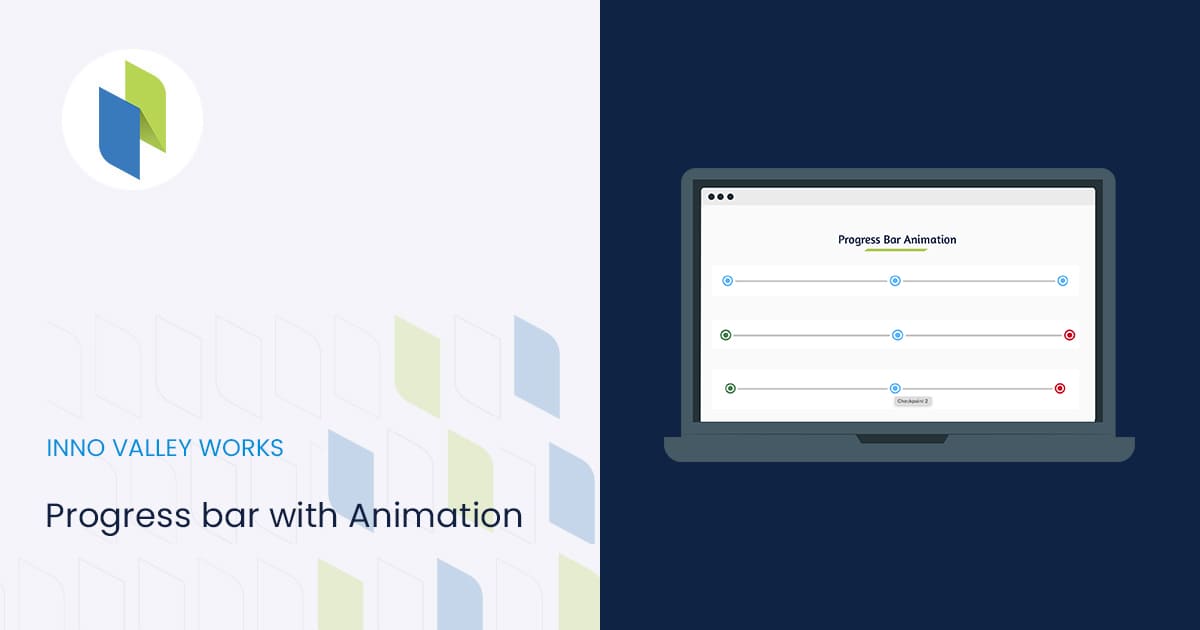
A basic one would look like below:
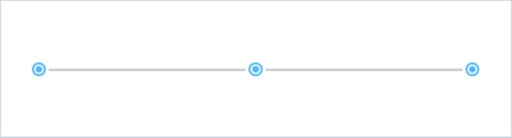
You can add more functionalities to this simple progress bar to make it user-friendly and attractive at the same time.
You can change the colors or add different functionalities at each checkpoint so that it would be easy for users to understand.
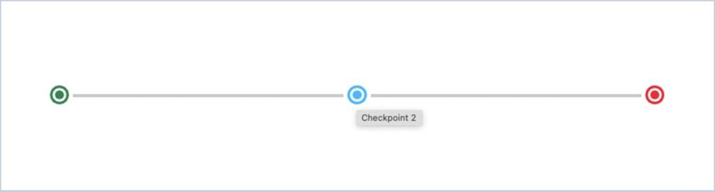
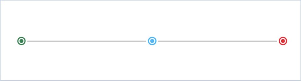
Let’s make it more interesting by adding an animation to the progress bar.
Video:
You would have noticed that one can also see the progress in percentage below. One could even add a toast or a completed email or any such functionalities at any milestone completed or reached.
Code Block:
progressBar.css:
.progress-width{
max-width: 95% !important;
min-width: 95% !important;
}


//Styles for the progress bar icons

.success-icon{
--sds-c-icon-color-foreground-default: #2e844a;
--sds-c-icon-color-background: #ffffff;
}
.default-icon,.choice-icon {
--sds-c-icon-color-foreground-default: #1ab9ff;
--sds-c-icon-color-background: #ffffff;
}
.error-icon {
--sds-c-icon-color-foreground-default:#ea001e;
--sds-c-icon-color-background: #ffffff;
}
progressBar.html:
<template>
<div class="slds-card slds-p-around_x-large">
<div class="slds-progress slds-p-around_none progress-width">
<!--Progrss bar icon setup-->
<ol class="slds-progress__list">
<template for:each={markerDetails} for:item="checkpoint">
<li class="" key={count}>
<button
class="slds-button slds-button_icon slds-progress__marker slds-progress__marker_icon"
title={checkpoint.iconName} data-name={checkpoint.iconName} >
<lightning-icon
icon-name="utility:choice"
size="small"
alternative-text={checkpoint.iconName}
class={checkpoint.iconClass}
data-name={checkpoint.iconName}
onclick={handleProgressBarSelection}>
</lightning-icon>
<span class="slds-assistive-text">{checkpoint.iconName}</span>
</button>
</li>
</template>
</ol>
<!--Progrss bar setup-->
<div class="slds-progress-bar slds-progress-bar_small" aria-valuemin="0" aria-valuemax="100"
aria-valuenow={currentDocPercentage} aria-label="Label" role="progressbar">
<span class="slds-progress-bar__value" style={singleDocPercentStyle}>
<span class="slds-assistive-text">Progress: {currentDocPercentage}</span>
</span>
</div>
</div>
<!--Message section-->
<div class="slds-align_absolute-center"><div class="slds-text-title_caps slds-p-vertical_medium">Percentage completed: {currentDocPercentage}%</div></div>
</div>
</template>
progressBar.js:
import { LightningElement } from 'lwc';

export default class ProgressBarLwc extends LightningElement {
currentDocPercentage = 0;
//Sets the value of the progress
singleDocPercentStyle = 'width:0%';

//Simple set up for the icon, this can be made dynamic
markerDetails = [
{ iconName: 'Checkpoint 1', iconClass: 'success-icon'},
{ iconName: 'Checkpoint 2', iconClass: 'choice-icon'},
{ iconName: 'Checkpoint 3', iconClass: 'error-icon'}
];

//onclick event that is fired on clicking the icons
handleProgressBarSelection(event){
this.currentDocPercentage = 0; //Initial width of the progress bar
this.singleDocPercentStyle = `width:${this.currentDocPercentage}%`;

//Animation setup
setTimeout(() => {
let intervalID = setInterval(() => {
//Set at 100% to stop the animation, needs to be modified as you need to work at different checkpoints
if (this.currentDocPercentage === 100) {
clearInterval(intervalID);
} else {
animate();
}
}, 30);//this sets the speed of the animation
}, 10);

const animate = () => {
//This increases the value of the progressbar and by using the animation we slow down the progress
this.currentDocPercentage++;
this.singleDocPercentStyle = `width:${this.currentDocPercentage}%`;
setTimeout(() => {
this.singleDocPercentStyle = `width:${this.currentDocPercentage}%`;
}, 10100);
};
}
}
We are Inno Valley Works, We are a passionate team of developers, best thinkers and consultants who can solve anything and everything.
With our highly engaging team, you can easily bring the vision to all your business ventures come true.
We have team, put your problem, get your solution
🎥 Check Out Our YouTube Channel
Explore helpful tutorials, product updates, and feature walkthroughs from the team at Innovalley Works.
👉 Visit Our Channel


 .
.